Askmo
EDMODO.com / june 2017
AskMo is a collection of school-safe educational videos for students, parents, and teachers. It compiles the top educational videos shared on Edmodo and sorts them by grade and subject, to allow people to explore new concepts and ideas. AskMo began as a passion project for one of the lead engineers, but excited the leadership of the company who decided to push for an early launch, which meant it needed to be designed. For this project, I worked with one marketing designer and a small team of engineers to design an updated look for AskMo’s launch at the education conference of ISTE in 2017. The goal was to clean up the appearance of the Askmo site and create a version of the marketing landing page that featured Askmo videos and content that was ready to go by the conference. We had a extremely limited design timeline of one week and two weeks of engineering to prepare for the launch. I took lead for the AskMo site redesign, while the marketing designer worked on the landing page and the publicity for the launch.
the starting point for the redesign

Process
We jumped immediately into designs after an initial meeting on the project plan, because we wanted to produce basic wireframes and a flow by the end of the day. I began quickly iterating on the card layout for the videos and how we might incorporate the content into the home page. Due to the pace of this project, I kept fidelity low and the designs quick and to the point.
THe PROCESS
We settled on a general grid structure and decided to move forward with higher fidelity designs. At this point, I started developing standards for individual elements. It was important to differentiate topic cards from resource cards. Topic cards are collections of related resources and do not have additional information attached, such as a specific title, description, links, or media. I started building lightweight design standards based on Edmodo's overall brand guidelines. It was important that the componentry was simple and to the point so that it could be quickly implemented. These were actually handed off to the engineers before the overall design was finished to allow for quick implementation.
The Final Product
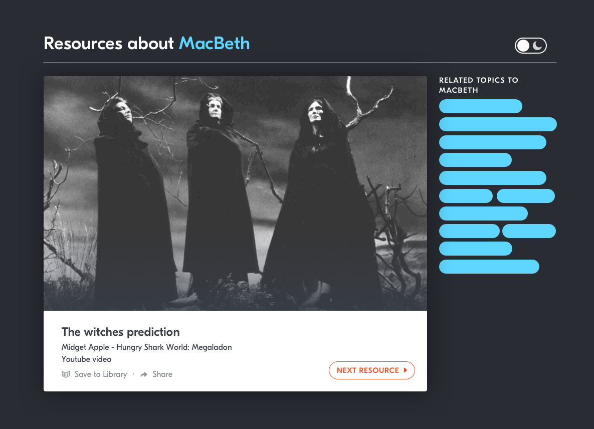
The final step was putting everything together. We chose a lightweight sidebar organization system because topics and resources can fit into multiple categories. This allowed us to highlight each of the categories it may be in. AskMo was designed on a responsive grid system, so depending on the screen size, there would be fewer columns displayed. Our goal to improve the design, while keeping it within scope forced me to be smart. The majority of the improvement came on the resource page. We made it far easier to navigate to similar resources or topics while still focusing attention on the resource. Engineering was able to implement the design in time for ISTE 2017 and it was a huge hit with Teachers!